Introduction
Windows 10 Technical Preview has been recently update and it got even better. In this review post, I will cover some new features in Windows 10 TP.
Start Menu
Yep, the Start button and the Start menu are back again. The Start menu is now a hybrid between Windows 7 start menu and Windows 8 tiles menu:
While in the Start menu, you can search for your application by typing its name in the search box.
The Start menu can be maximized (![]() ) so it looks like the Windows 8 tiles menu:
) so it looks like the Windows 8 tiles menu:
The Taskbar
Two new optional buttons can now be shown on the taskbar. The first one is the search, where Cortana drives the search. The second button is for “Task View”:
In the following snapshot, the Cortana search button is configured as “Show search box”:
When interacting with Cortana, you will get results while you type your question:
Look and feel
We will cover some of the new UI changes that make Windows 10 UI look nice.
Looks
The windows are now slicker. The frame is much thinner and so the window looks elegantly borderless:
The window icons (minimize, maximize, close) are redesigned and look cooler. One can also observe new icons designs from the “This PC” window (also known as “My Computer”):
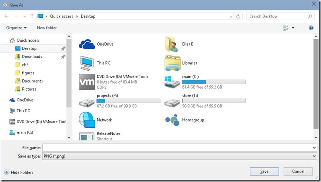
Also observe the icons for the “Save as” dialog:
Modern apps get an extra menu for sharing/searching/printing and settings:
The modern apps can be experienced in variety of modes:
- As a window app: a resizable window on your desktop
- Maximized: occupies the whole desktop screen estate but does not go full screen and cannot hide the start menu
- Full screen mode
 : In this mode, the app occupies the full screen and hides the start menu.
The notification center
The notification center is accessible from the tray icons area:
Settings
The settings represent the “Control Panel”. You can search for the setting names or click on the icons:
App sizes settings page:
Network settings page:
Multiple Desktops
Windows 10 now allows you to create and work with multiple desktops. Simply click the desktops icon or press WinKey+Tab to launch the task view:
In the task view, you will see all your open apps and you will also see all the desktops and a button that allows you to create a new desktop:
It is possible to move applications from one desktop to another by right-clicking on the app and selecting which desktop to move the app to:
Apps
That’s how the new calculator looks like:
It is slick and has the same functionality as before.
The Photos app also looks different:
And this is the task manager:
Conclusion
Overall, I like Windows 10 TP. I have to admit though that it has many similarities with Mac OS X (Yosemite), which reminds me of the Win OS X logo 🙂


settings are still not ordered by name :S ?
That’s really minor! 🙂 I usually type/search for them anyway, it is faster than browsing visually.
but why is this so hard for them to implement.
Imagine you are on phone or tablet. It is much faster to scroll instead of search.
How stable is windows 10 right now? enough to make a switch already? I usually installed consumer preview and it was allright.
@djcrystal: I would not advise to do a full switch. They are still adding things….and besides, who knows how easy it will be to upgrade from TP to final build!
I am having problems with RDP. It hangs 3/10 times, each time I try to connect.